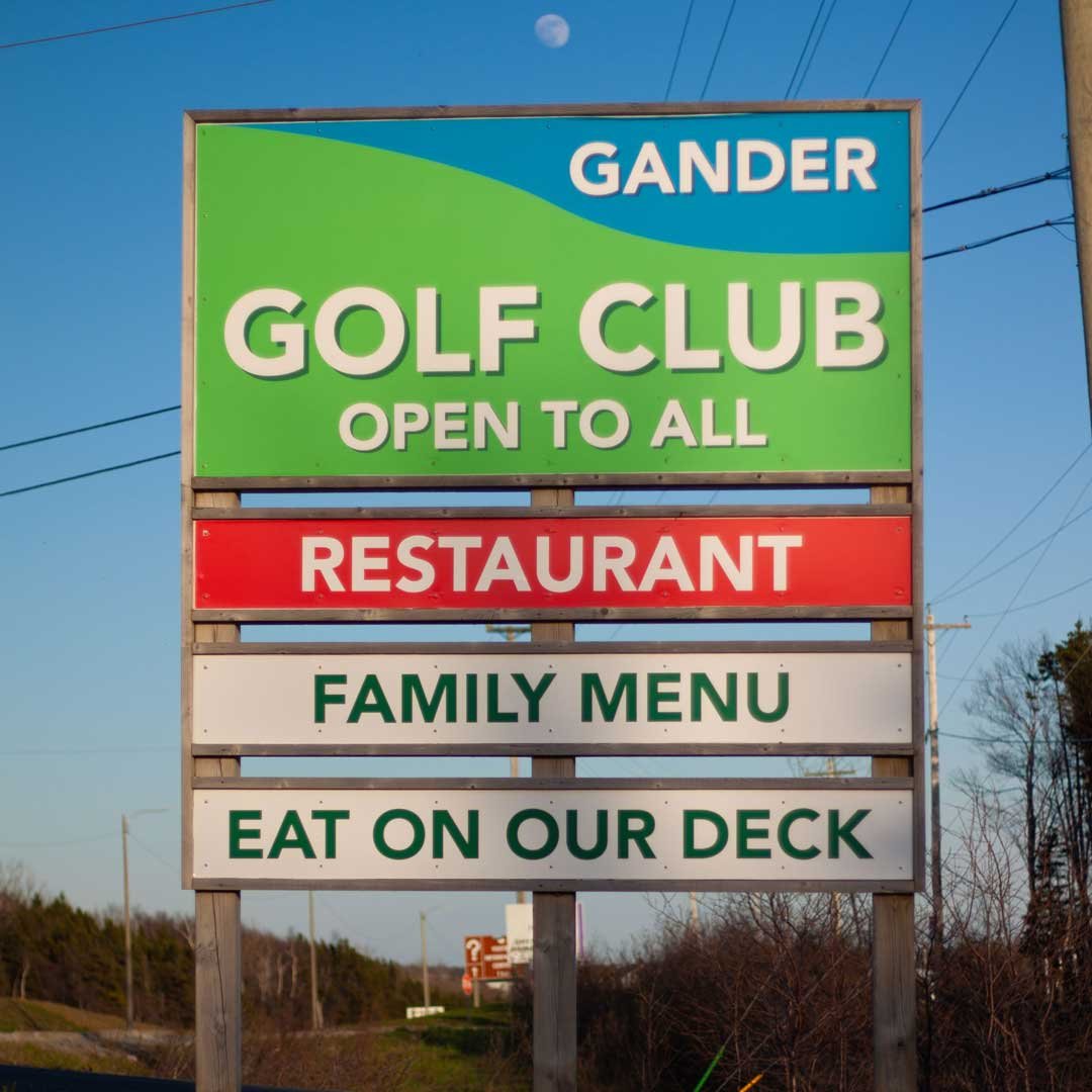
Gander Golf Club
Signs & Posters
There's no hidden message or witty angle on the Gander Golf Club sign. Simplicity was the chief creative objective. The green colour represents "the greens" of the golf course, where the game is played. The blue represents "the blues", which is when the beer runs out.
Still can't tell if you're looking at the sky or the lake? If it's kind of close it's the lake. If it's really far away it's the sky.
It took at least 5 years for "EAT ON OUR DECK" to get vandalized. I didn't think it would take that long.
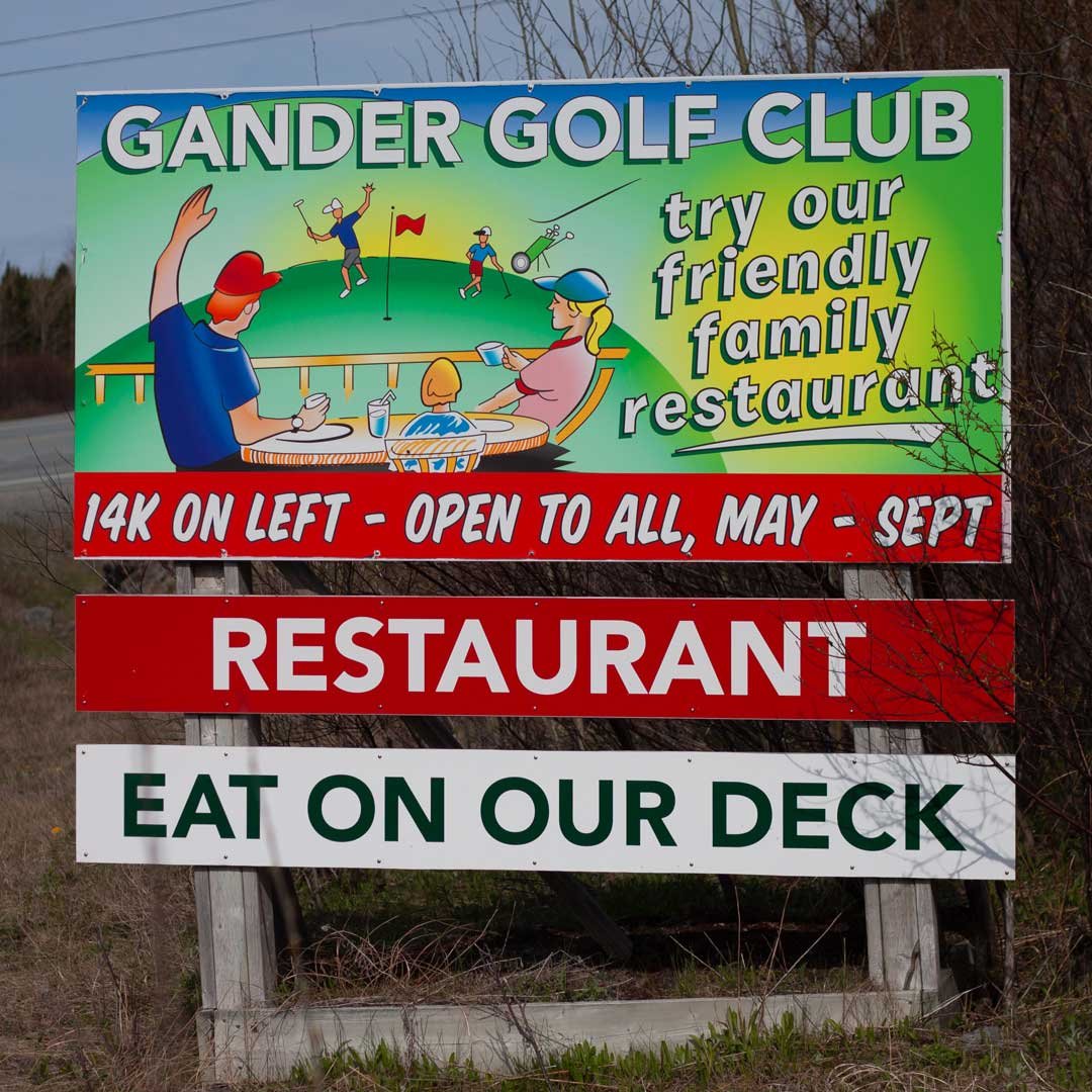
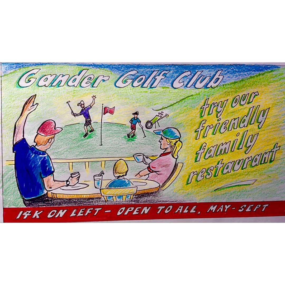
You'd probaly have to drive by this 6 times to read it. It's a lot of text for a highyway sign. The vibe is the real message though. The golf club wants everyone to know it's not exclusive. The restaurant is the best place to eat if you're passing through Gander in the summertime. It's right on the highway, The deck has an incredible view and the prices beat par. $17 for a clubhouse and fries in 2024.
Comedian Pete Soucy drew the concept for his brother Dave, who ordered the sign on behalf of the Golf Club. I tried to capture the spirt of his illustration as closely as possible.

This sign, located just past the parking lot, orientates new visitors.
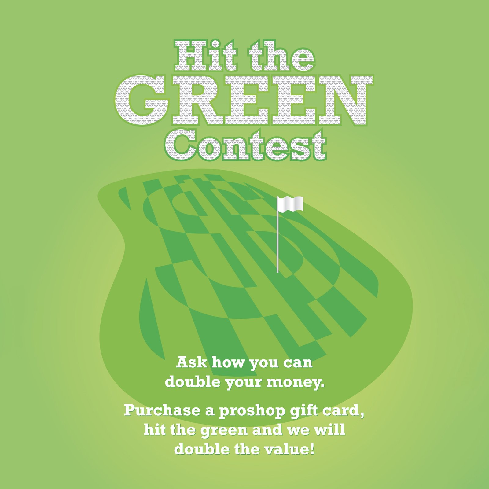

Some promotional images. You can't go wrong with an animal in a funny hat. It really cracks people up, especially one they've hit the green.
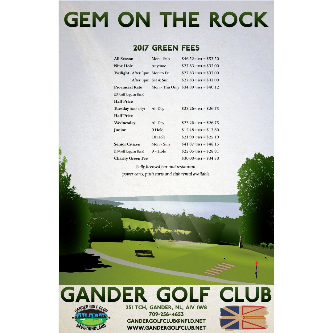

This poster and rack card set were printed back in 2017.

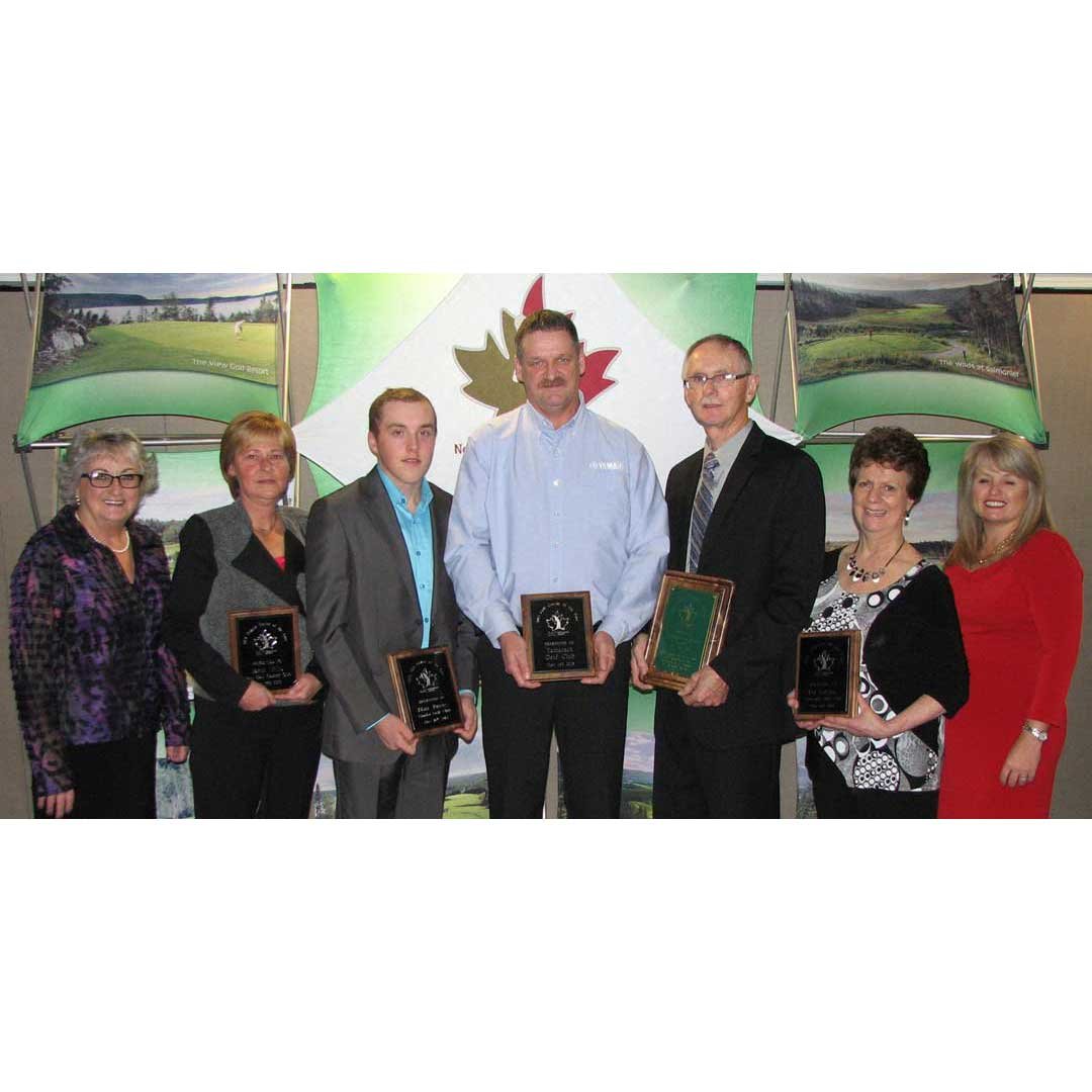
I designed and engraved the annual awards for NL Golf in 2013.