Town of Gander
In House Design
I was employed by The Town of Gander as a graphic designer for a few months in 2008. Here are some highlights.
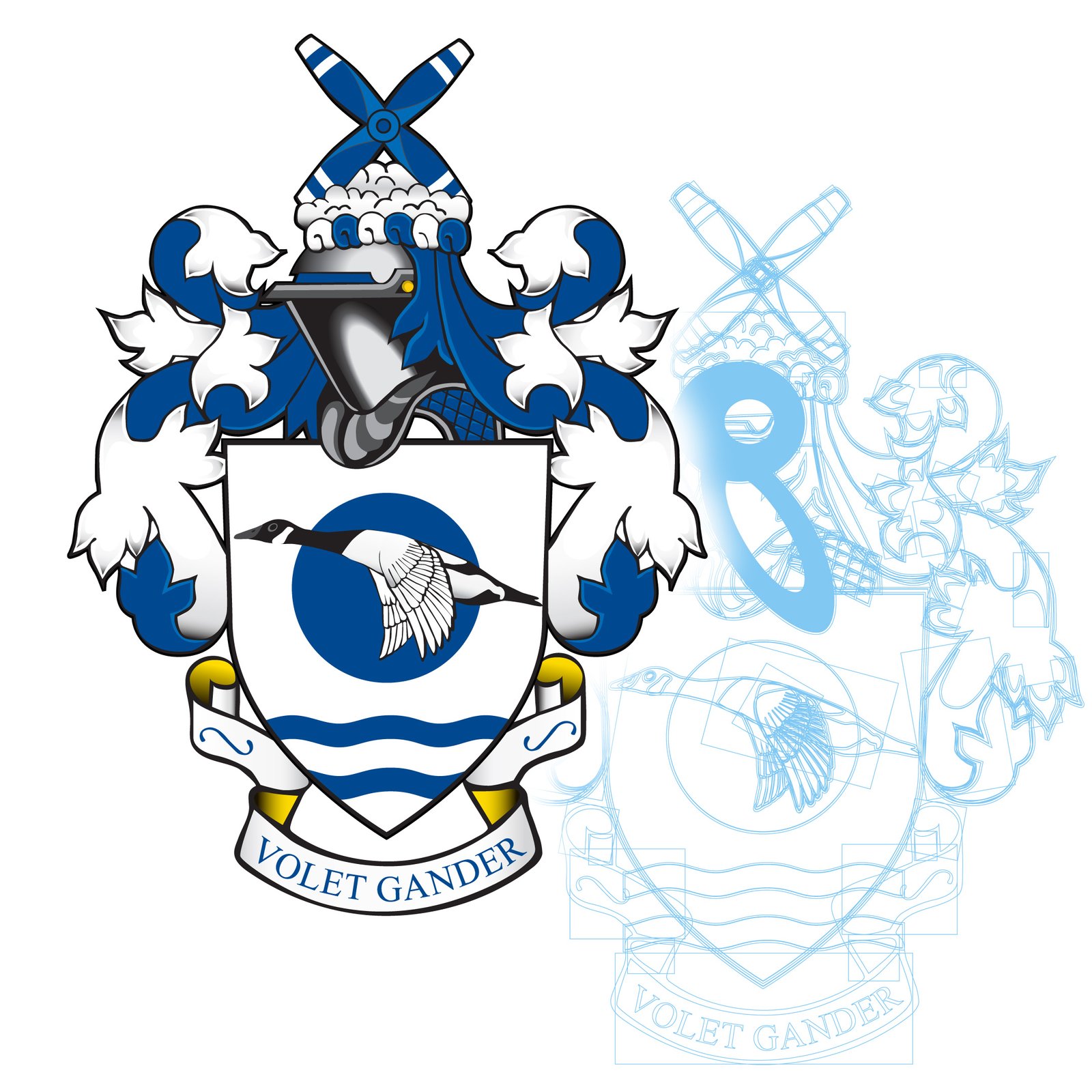
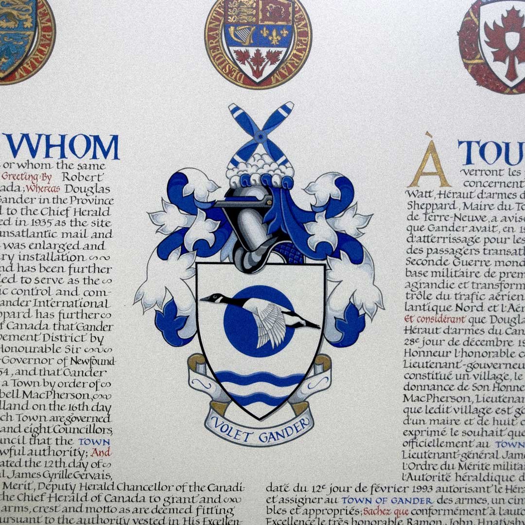
I vectorized the town coat of arms. You can find the original behind the Mayor's seat in Council Chambers. It was designed and painted by the Canadian Heraldic Authority in 1993.
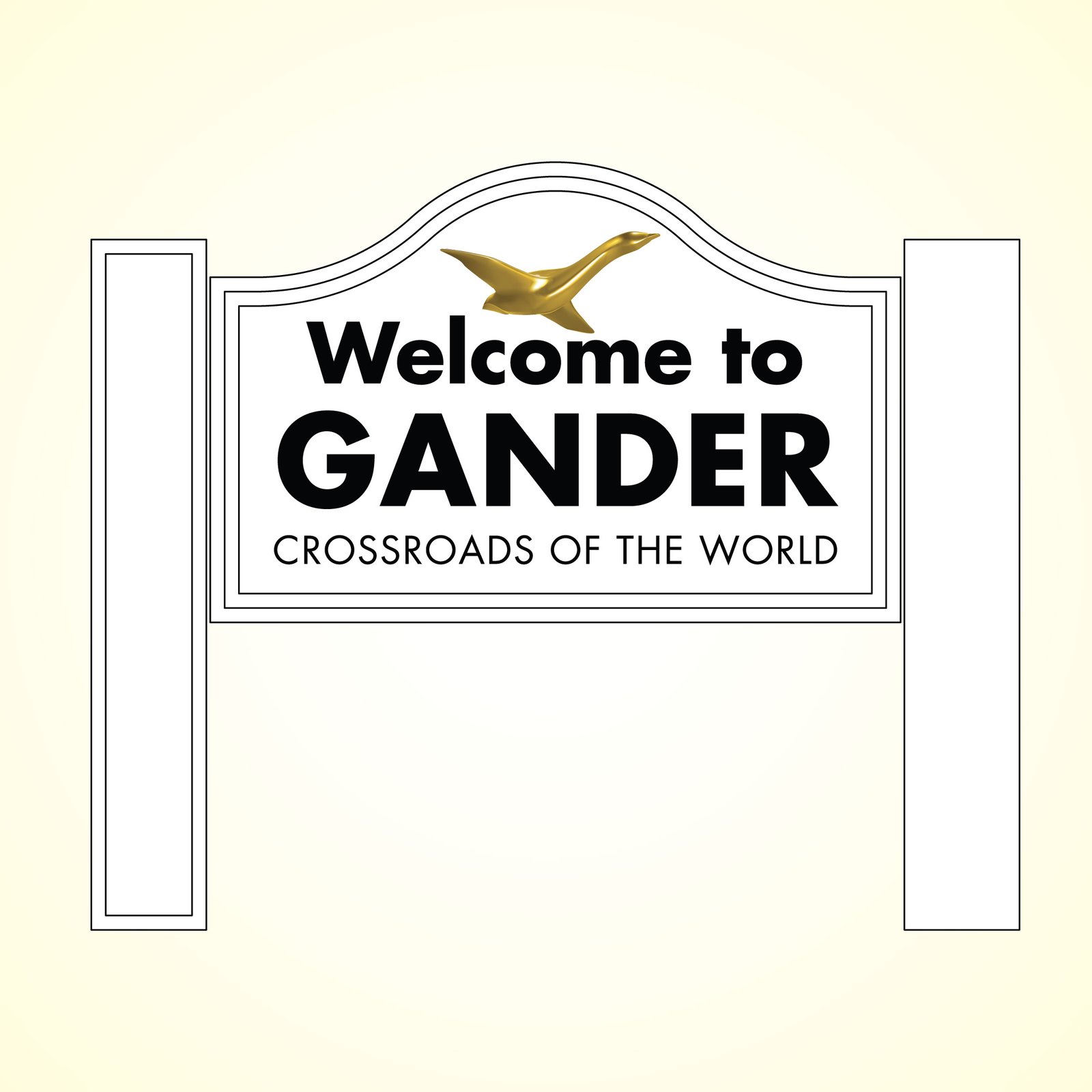
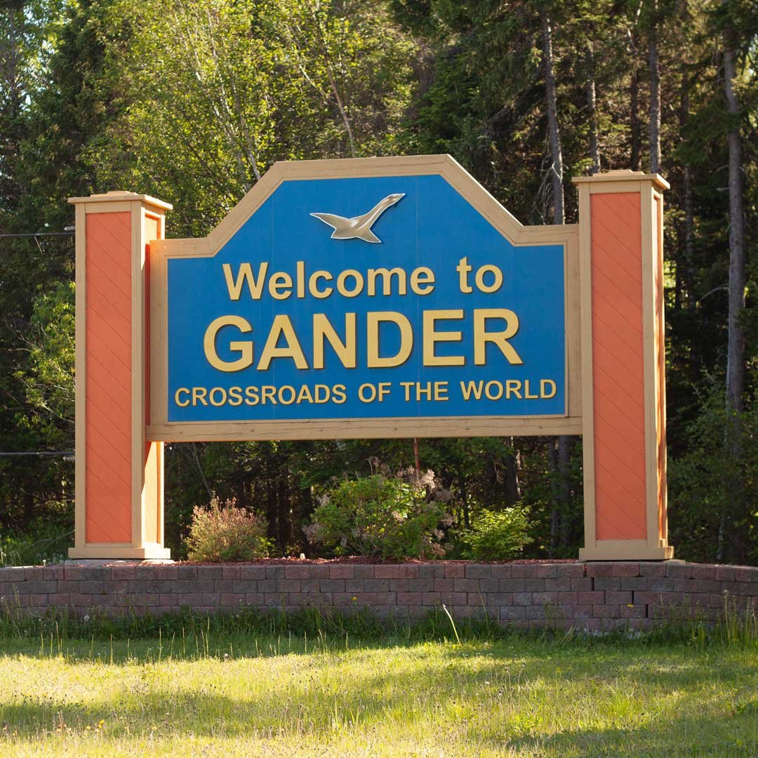
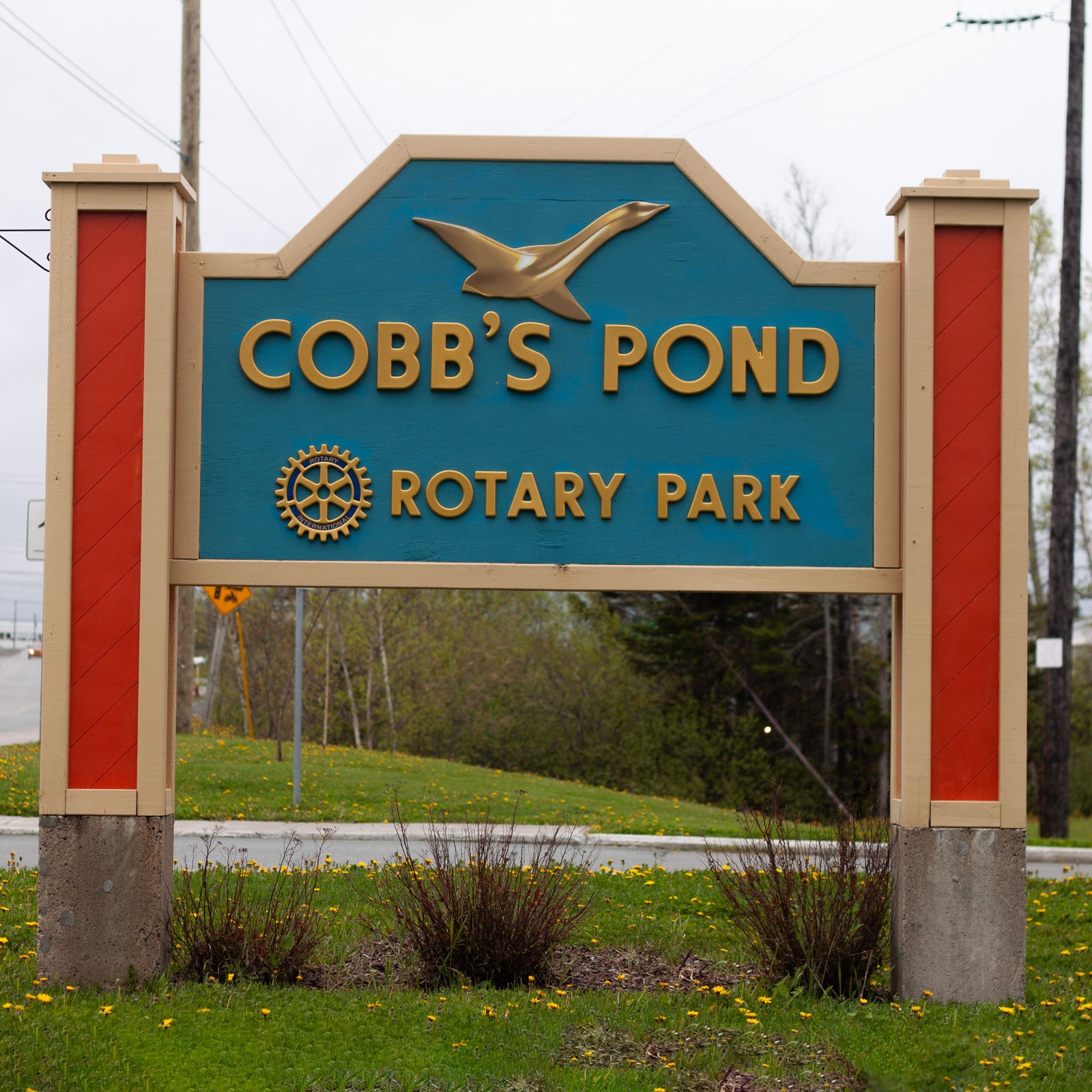
I did preliminary work on some welcome signs that ended up being built after I left. Which is very cool. There’s a smaller sign at Cobb’s Pond that I was hired to make look like those signs while at PJ Sports. I got to work directly with the letter fabricator that time and it came out even better.
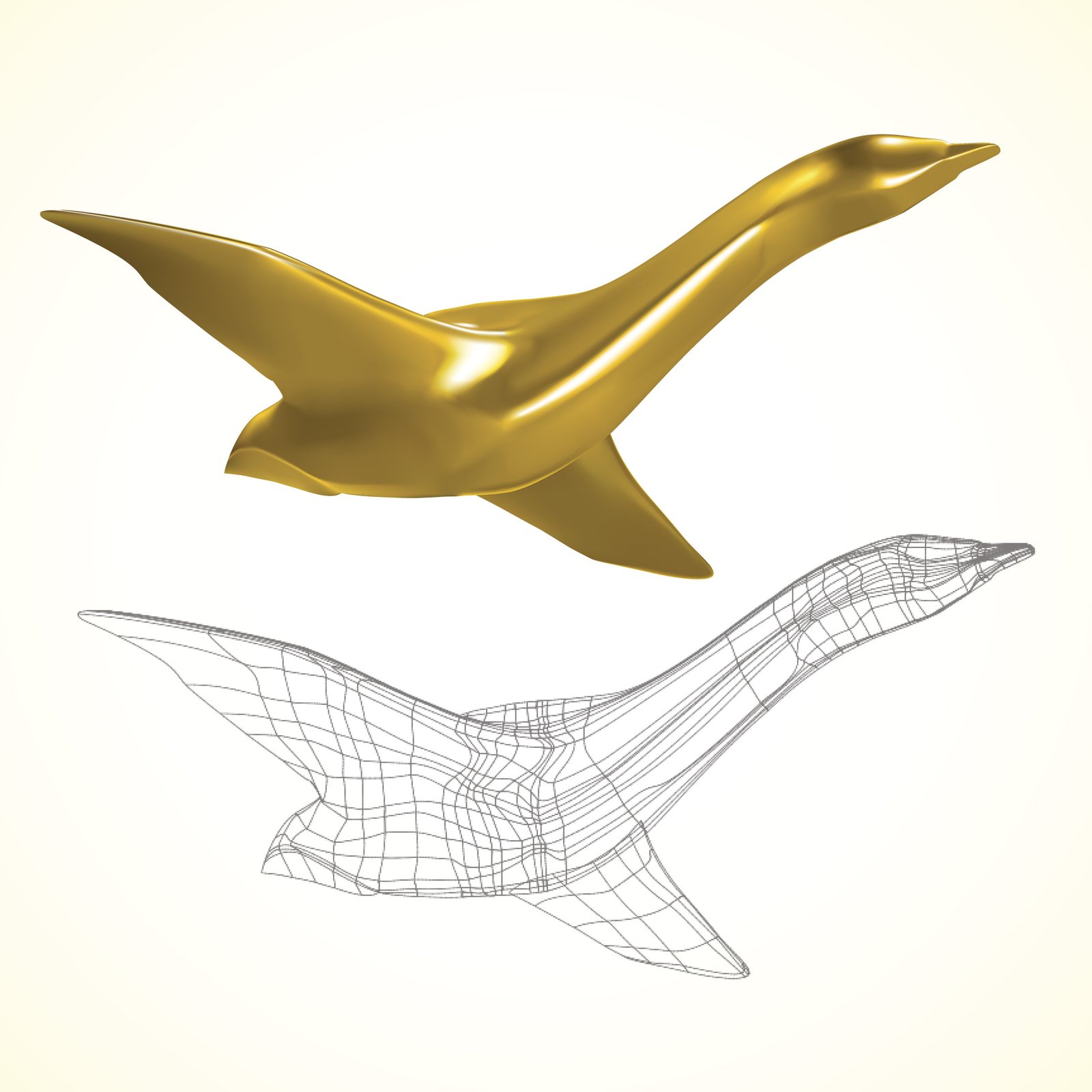
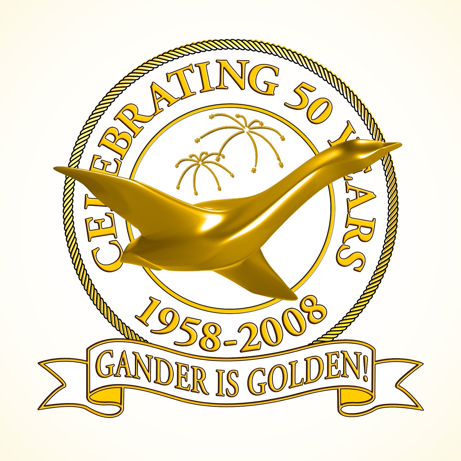
I did not design the goose that now serves as Gander's logo. I can tell you where it came from though. Dave Knott created a silver version goose in 3ds Max for a high tech ad around 2003. It was a summer student project and Greg Seaward, the town's media coordinator, was the art director. He was looking for a blend of a goose and a Concord. The silver HONKcord, tinted gold, was just what he needed for the 50th Anniversary badge. I made a gradient mesh of that to use on the welcome signs and that allowed us to stick it everywhere. It was so prevalent that when they decided to unify the Town's identity a one colour, Canada Goose, version of it was used for the primary logo.
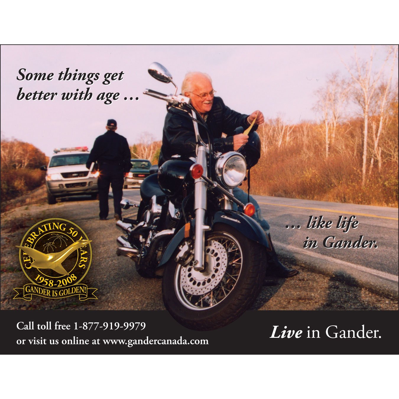
Greg Seaward staged this photo of Bob Briggs getting a ticket a few years before he used it. He wanted to make an ad about "really living". This is what we worked out. It was placed in Downhome Magazine targeting expat retirees. Not all the cops loved the ad. That's Oz Fudge's bum in the picture though. He got a kick out of the ad.
Yes the same Oz Fudge portrayed in Come From Away telling people to "Slow the Fuck Down!"
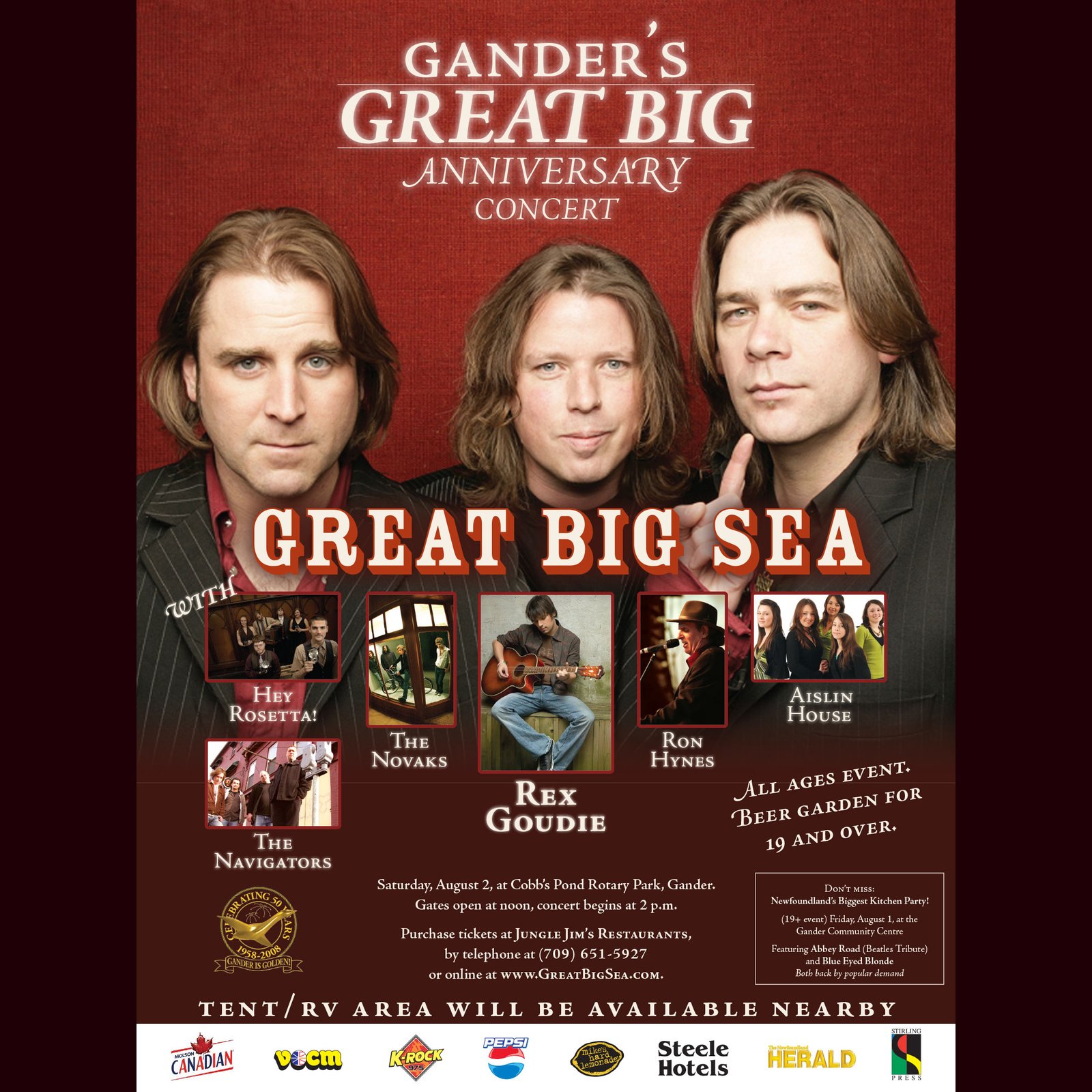
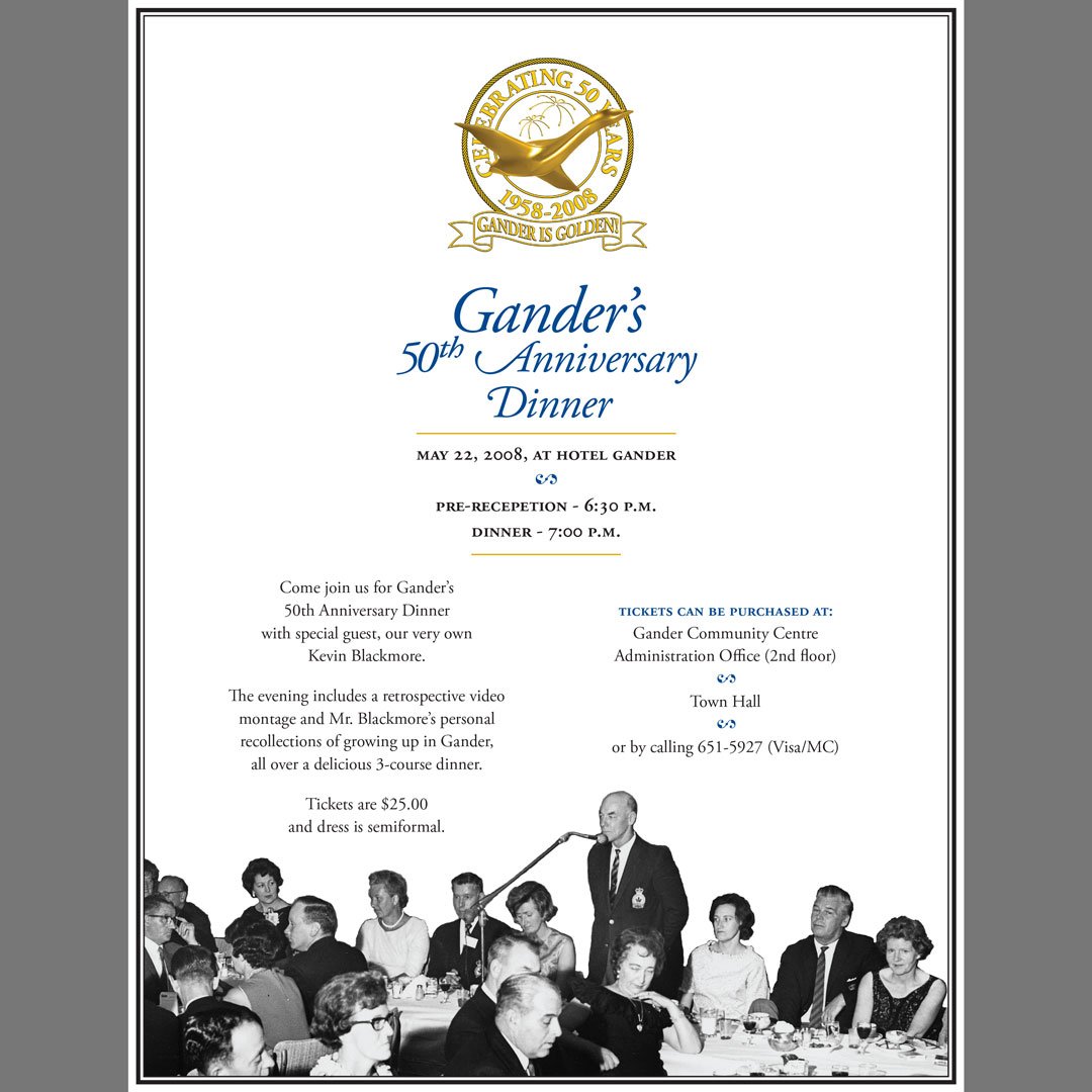

My biggest job at the town was promoting our 50th anniversary. The concert poster was produced in InDesign and printed by Stirling Press. The dinner was advertised in the newspaper and the Golf ad was featured in the NL Golf visitor's guide. Low key promoting Gander as a retirement location.

A quick AD for Targa highlighting its world class status.
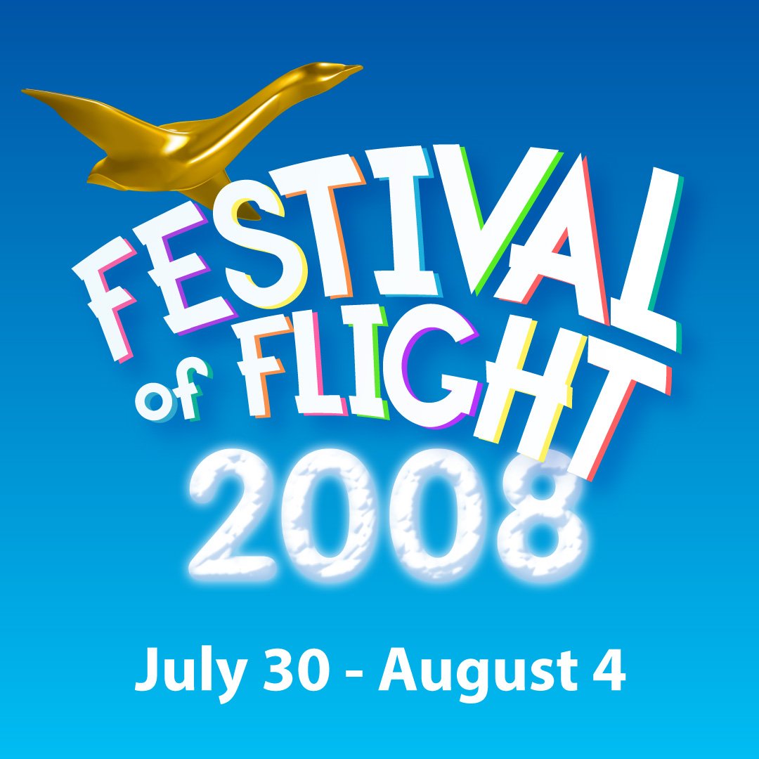
2008 Festival of Flight identity. Clear skies and bright colours.
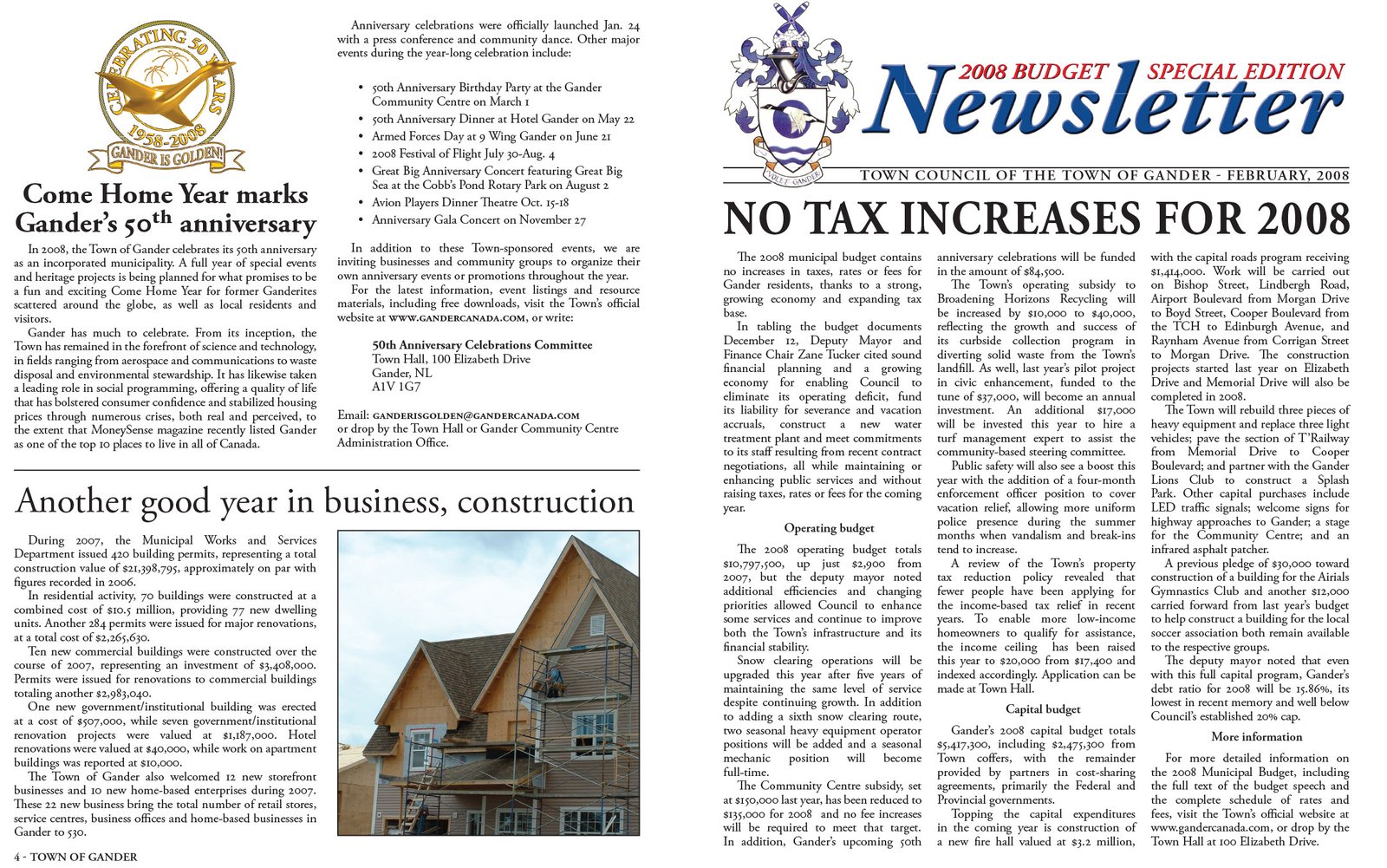
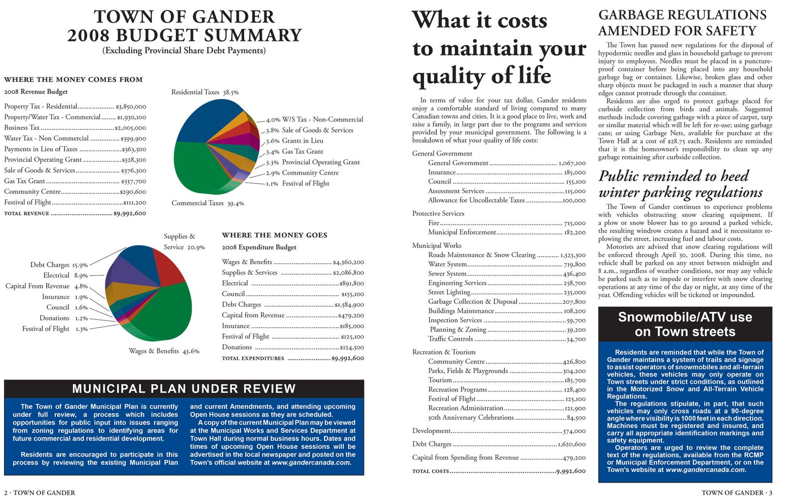
I think Greg wanted to revive the name "Propagander" but got shut down. Layout by me in InDesign.
A flash animation for the town website.
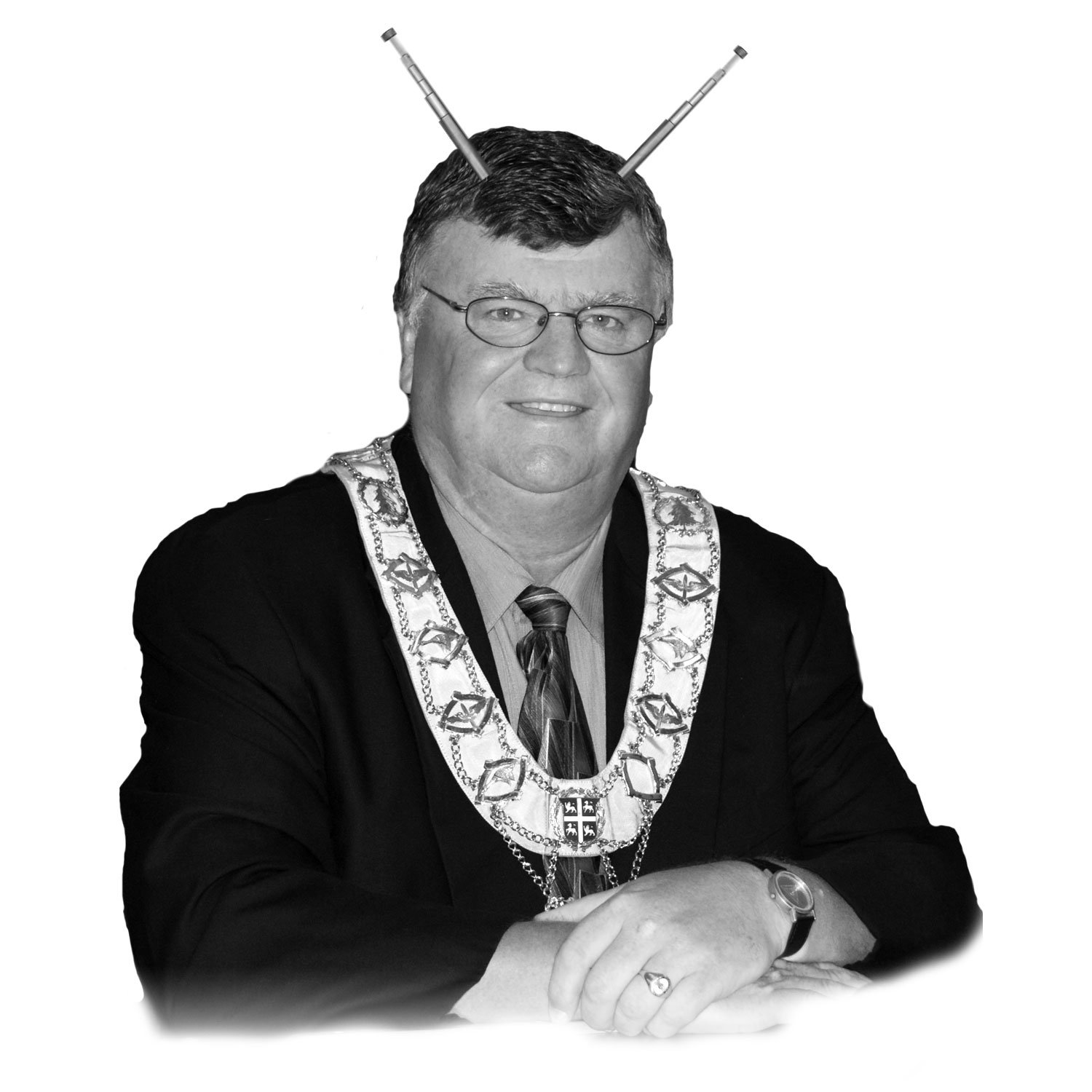
This photo was in a press release celebrating a crater on Mars named “Gander”. Caption "My Favourite Mayor"